WHY A NEW LOGO?
The new logo was developed to coincide with the University’s 60th anniversary. Since the University’s logo was last redesigned in 2012, AUP has made huge strides toward achieving its aim of becoming the premier American international institution of higher learning in Europe. The new logo continues this reputational journey, projecting AUP into an exciting future.
We are proud of the academically rigorous, transformative educational experience that we provide to the global explorers who are our students. Our new logo aims to communicate our confidence and ambition to new, diverse constituencies as we enter our seventh decade.


Crafting a design that best represents AUP in all its multitudes has been an incredible travail d’equipe. After assessing several potential candidates from within the AUP community, we appointed alumnus André Lavergne ’14 as the new logo’s lead designer. In partnership with André and his team, the Office of Communications lead a semester-long creative process, involving students, faculty, staff, alumni, the AUP Leadership Team, communications professionals, college counselors and employers.
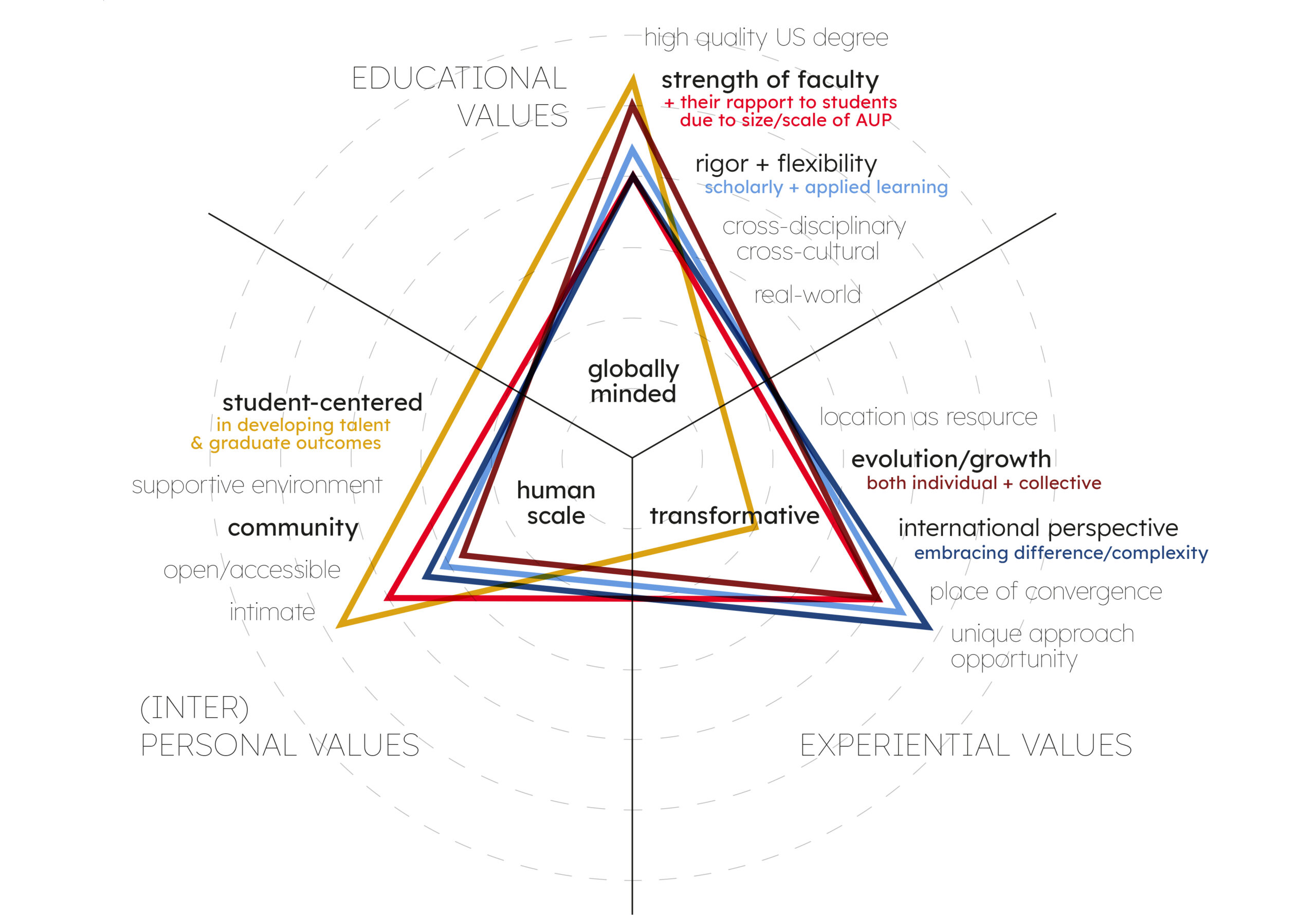
Through a series of surveys, community members were invited to share details of their personal experience of AUP in the form of a “journey,” in order to help us map out the University’s own reputational pathway. This provided crucial insights for both the theoretical and creative stages of the process.
COLLABORATIVE PROCESS


STRATEGIC THINKING
Together, we developed a logo that strikes a balance between where we are as a community today and where we want to go tomorrow. It represents our confidence in the educational model that we provide and our ambition to solidify our position as a leading American international university abroad, one that educates global explorers to become independent, creative thinkers; engaged, lifelong learners; responsible actors and empowered leaders; and adaptable communicators with a global perspective.
The following are examples of the insights that emerged from participating committees and informed our visual research.
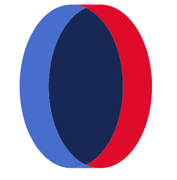
CONTRAST & CONVERGENCE
Small school, big ideas. Human-scale in every way. Where diverse individual journeys converge to form a unique collective experience.

MULTIPLE PATHWAYS
Diverse trajectories that form a rich, multi-layered experience. A place where you can follow your own pathway even if it changes along the way.
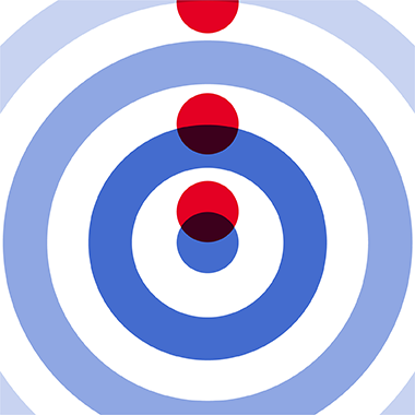
MOTION & TRANSFORMATION
A transformative experience that both changes us and changes the world we live in. Positive impact, expansiveness, interconnectedness.

CONTRAST & CONVERGENCE
Small school, big ideas. Human-scale in every way. Where diverse individual journeys converge to form a unique collective experience.

MULTIPLE PATHWAYS
Diverse trajectories that form a rich, multi-layered experience. A place where you can follow your own pathway even if it changes along the way.

MOTION & TRANSFORMATION
A transformative experience that both changes us and changes the world we live in. Positive impact, expansiveness, interconnectedness.
MONOGRAM
Our bold move to a monogram style helps bring new audiences into our international community, where we already refer to AUP by its initials. It also means a more flexible logo, applicable across a variety of use cases – something important to ensuring a long-term branding solution.
MONOGRAM
Our bold move to a monogram style helps bring new audiences into our international community, where we already refer to AUP by its initials. It also means a more flexible logo, applicable across a variety of use cases – something important to ensuring a long-term branding solution.

PATHWAYS
AUP’s new strategic plan focuses on the importance of pathways to a student’s personal and professional development. This concept is central to the logo redesign. At AUP, pathways represent the unique journeys of individuals through academia and into meaningful careers. Design-wise, the sense of movement, imbued into the logo and typography using negative space, helps evoke this notion.
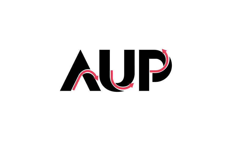

TRANSFORMATION
AUP challenges individuals to grow academically and culturally, both individually and together as a community. The monogram design transforms the letters AUP; they start one way and end another, taking an unexpected turn. This evolution mirrors the transformative education that global explorers receive at the University.
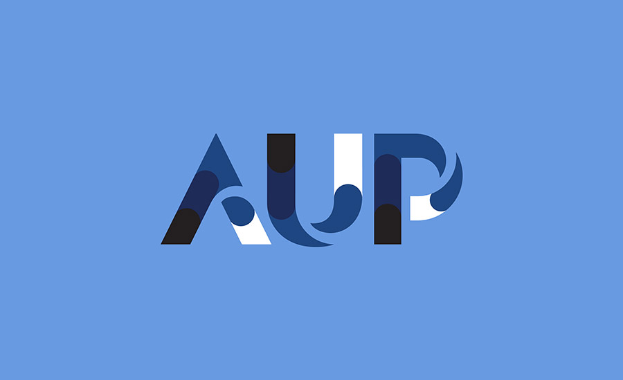

SCALE
AUP is a small university with a big impact. It’s an intimate environment that students refer to as a home away from home. Studying global perspectives in a close-knit community is a key element of the AUP experience. To incorporate this interplay of scales, the monogram displays the letters of our acronym in three different ways, using negative space to hint at the multilayered nature of an AUP education.

CONVERGENCE
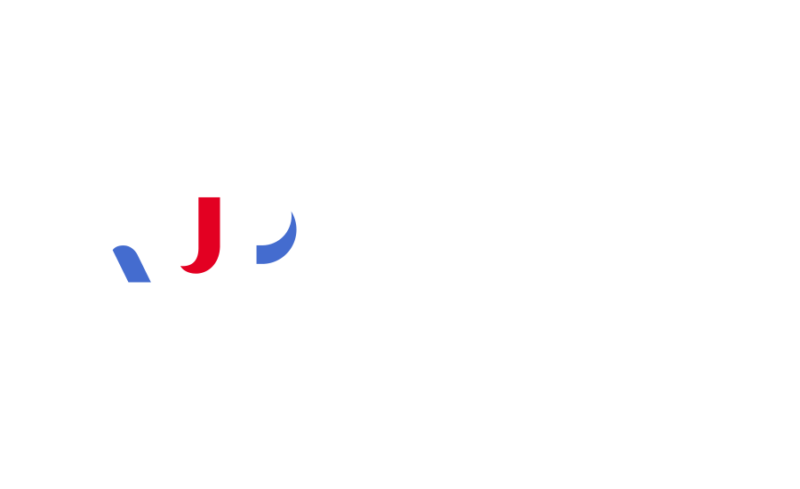
The logo combines the University’s roots in the American education system with its geographical home in Paris. The color choice of red and blue incorporates the colors of the French and US flags, creating a chromatic common ground where different cultures and perspectives come together – just like they do at AUP.

The resulting logo presents AUP as a multilayered, transformative experience that starts in Paris and leads wherever students’ unique pathways take them in the world – always in a way that has impact. It exists in three-, two- and one-line versions and as a standalone monogram.
The logo aims to be a long-term solution to the University’s branding needs, one that will accompany AUP through the next stage of its own institutional pathway. Below, you’ll find examples of some of the new gear that you can order from our online store.
A LOGO BUILT TO LAST
THE 60TH & BEYOND
As the new logo launches alongside the start of our 60th anniversary celebrations, it also exists in a celebratory version designed to acknowledge this landmark year. Rather than permanently incorporate the anniversary date in the main logo – as was the case with previous versions – we opted for a temporary anniversary version to celebrate the University’s myriad achievements while also ensuring the new logo’s permanence.


