Since it was founded in 1962 as the American College in Paris, The American University of Paris has had more than a dozen logos, each serving to carry the AUP name across the globe. As we developed a new logo ahead of our 60th anniversary, designed to carry the University into an exciting future, we revisited past designs to take stock of how far we’ve traveled and to help us determine which pathway to take next. Take a walk down memory lane as you look for the logo that represented AUP during your time in Paris.
1962
The logo that marked the beginning of a 60-year adventure in Paris.
1962
The logo that marked the beginning of a 60-year adventure in Paris.

1964
Just two years later, the logo evolved to include a visual reference to the city of Paris.
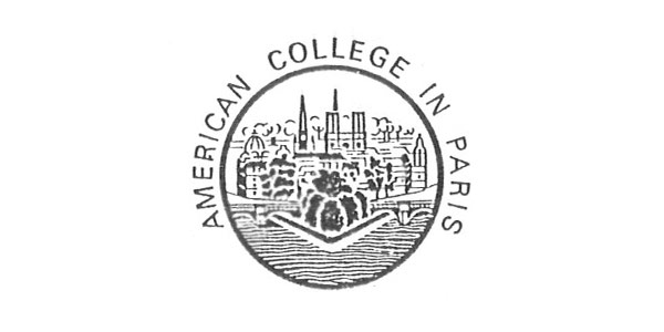
1964
Just two years later, the logo evolved to include a visual reference to the city of Paris.

1967
The new logo paid tribute to the location of AUP’s first classrooms in the American Church in Paris.
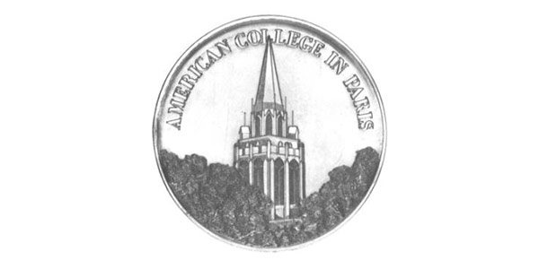
1967
The new logo paid tribute to the location of AUP’s first classrooms in the American Church in Paris.

1982
Fifteen years later, ACP gave its logo a strong touch of color for the University’s 20th anniversary.
1982
Fifteen years later, ACP gave its logo a strong touch of color for the University’s 20th anniversary.

1983
Following the anniversary, the new logo variation included explanatory text, including, for the first time, text in French.

1983
Following the anniversary, the new logo variation included explanatory text, including, for the first time, text in French.

1987
For its 25th anniversary, ACP introduced the French translation of its name for the first time.

1987
For its 25th anniversary, ACP introduced the French translation of its name for the first time.

1992
Following the change to university status in 1988, the logo now includes AUP’s full name as we know it today.
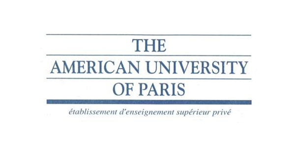
1992
Following the change to university status in 1988, the logo now includes AUP’s full name as we know it today.

2000
The turn of the millennium saw a clear departure from previous typefaces to a Lombardic capitals style.
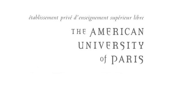
2000
The turn of the millennium saw a clear departure from previous typefaces to a Lombardic capitals style.

2002
The style was maintained for AUP’s 40th anniversary two years later, with this variation in a lighter color.
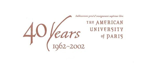
2002
The style was maintained for AUP’s 40th anniversary two years later, with this variation in a lighter color.

2004
A new logo was developed in 2004 in collaboration with a well-known marketing agency.

2004
A new logo was developed in 2004 in collaboration with a well-known marketing agency.

2009
Five years later, the colors were intensified and the slogan was dropped from the logo.

2009
Five years later, the colors were intensified and the slogan was dropped from the logo.

2012
For its 50th anniversary, the University developed a new logo with the help of AUP alumna Anne Ditmeyer G’10.

2012
For its 50th anniversary, the University developed a new logo with the help of AUP alumna Anne Ditmeyer G’10.


